We had clients in the office this week for a case management site implementation (kick-off and design session). Throughout the full day meeting, the importance of data visualizations in the storytelling aspect of case strategy kept coming up and how technology can rise to the challenge kept impressing the users.
 As I’ve said in previous blogs, we are a becoming an increasingly visual culture and our expectations for how information is presented to us follows suit.
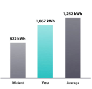
My electric bill, while terrifying in its high dollar amount, reassures me every month that I am within the normal range (or under) for my neighborhood with a cute little bar graph
After the initial sticker shock of the bill, I feel better because I can quickly (visually) see that I am below average in energy consumption.
I am greener than my neighbors, and I like that (a lot). When I am higher, which I do not like (at all), I become fanatic about my kids turning off lights and keeping the heat low.
Sitting in the implementation meeting this week, our clients walked us through their goals for the case and how they’d like to be able to tell the story – the data points they’d like to correlate and the facts that will support their strategy. Using CVLynx, our Litigation Management tool, we were able to show some ways that they could use visual analytics to quickly and easily tell their story in a compelling way.
The basic vagaries of the case are this: Opponent A alleges Product B caused X number of issues and want compensation for the all damages incurred to date.
Our client, Defendant C, says their Product B did not cause all of the issues and that only X percentage of the issues may possibly be the cause of an issue, and if Opponent A can prove that, they are only entitled to that same X percent of the total damages. With me so far? Great.
One of the ways our client wants to show the X percent of responsibility/liability is through dated reporting submitted throughout the manufacturing process. If the report was written prior to Date A, it is a possible cause of the issue, if it was written between Date A and Date B, it is a likely cause of the issue and if written after Date B, it is not their issue as Product C was used from that date onward.
Using a calendar heat map, we were able to display all of the submission dates of the reports and use color coding to show before, between and after those dates for several different issues – the red coded ones to be the of most importance.

Our clients were able quickly to see the distribution of those red and orange (hot) reports in the heat map, indicating there were reports detailing failures on those dates, click on the two dark orange and red dates in May and begin viewing those 11 reports. Visually, the heat map helped them find documents of interest and begin to bolster their strategy without ever running a search.
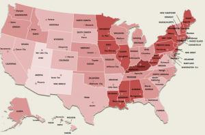
Another item of interest in the case is location of the issues across the US. Using the location field from the reports uploaded, we are able to visually use a location map to identify other reports of interest, using shading to identify the before, between and after dates.
This again allowed the client to quickly jump to the documents indicating failures in specific states without ever running a search.
Now, neither of the above visualizations is actual data from the case, and I changed some of the vagaries of the case, but I think I proved the point. Data is integral to proving facts in a case, but data points are hard to comprehend unless presented in a clear and impactful way.
Employing data analytics can help you to tell a better, clearer story and get your point across in a concise and effective way. I definitely recommend to both eDiscovery and Litigation Management clients that they use visual analytics to help tell the story of their case strategy.
 Just like with me and my electric bill, while I have the data point (ie. cost to me), it isn’t until I see the visual of that charge in context with my neighbors, that I really ‘get’ how I’m doing.
Which again, to underscore, I am greener (read: better to the environment) than my neighbors.

